
Key Takeaways
- What is the app design process for iOS and Android?
It’s a step-by-step journey that starts with research and strategy, moves through wireframing and prototyping, and ends with refined, platform-specific designs ready for real users.- How do iOS and Android app design differences affect the process?
While both platforms share core design stages, iOS follows Human Interface Guidelines and Android uses Material Design, each with unique rules for navigation, typography, and layout.- How do I design a mobile app step by step?
Sketch your idea, wireframe it, build a prototype, test it with users, and refine it. Tools like Figma and Adobe XD help you collaborate and improve throughout the process.
You’ve got an idea. Maybe it’s a clever productivity tool, a game-changing booking app, or the next viral sensation. You can already picture people tapping away on their phones. But when it comes to turning that spark into something real, things suddenly feel a bit… mystifying. Wireframes? UI kits? Native gestures? The app design process for iOS and Android can seem like a secret language only developers speak, but it doesn’t have to be.
This blog is your friendly translator. We’re going to unpack the app design process, step by step, in a way that’s creative, clear, and refreshingly jargon-free. Whether your app is destined for Apple’s sleek iPhones or the endless variety of Android devices, the design journey has some shared milestones and a few platform-specific detours. Let’s explore where the paths meet, where they split, and how to navigate both with confidence.
Before a single screen is sketched or a pixel is pushed, the groundwork has to be solid. The app design process for iOS and Android kicks off with discovery and strategy, arguably the most important phase of all. It’s where ideas meet research, and inspiration meets intention. This is your chance to figure out what problem your app solves, who it’s for, and how it’s different from what’s already out there. Think user personas, competitor analysis, and early concept validation, not flashy visuals, but strategic thinking.
Once the “why” is clear, it’s time to map out the “how.” This is where the app design process explained starts to feel more structured. You’ll build out the app’s information architecture (IA), defining how everything fits together, from onboarding flows to feature access. You’ll outline your content hierarchy, ensuring users always see the right information at the right time. And most importantly, you’ll clarify the core functionality that the design must support. Getting this blueprint right early saves headaches later, especially when designing for two ecosystems with distinct design expectations.
Got an app idea? Let’s make it real. You don’t need a tech background to bring your vision to life; you just need the right partner. At Twelfth Dream, we turn bold ideas into working apps with clarity, strategy, and custom development.
Take your first step from idea to app today!
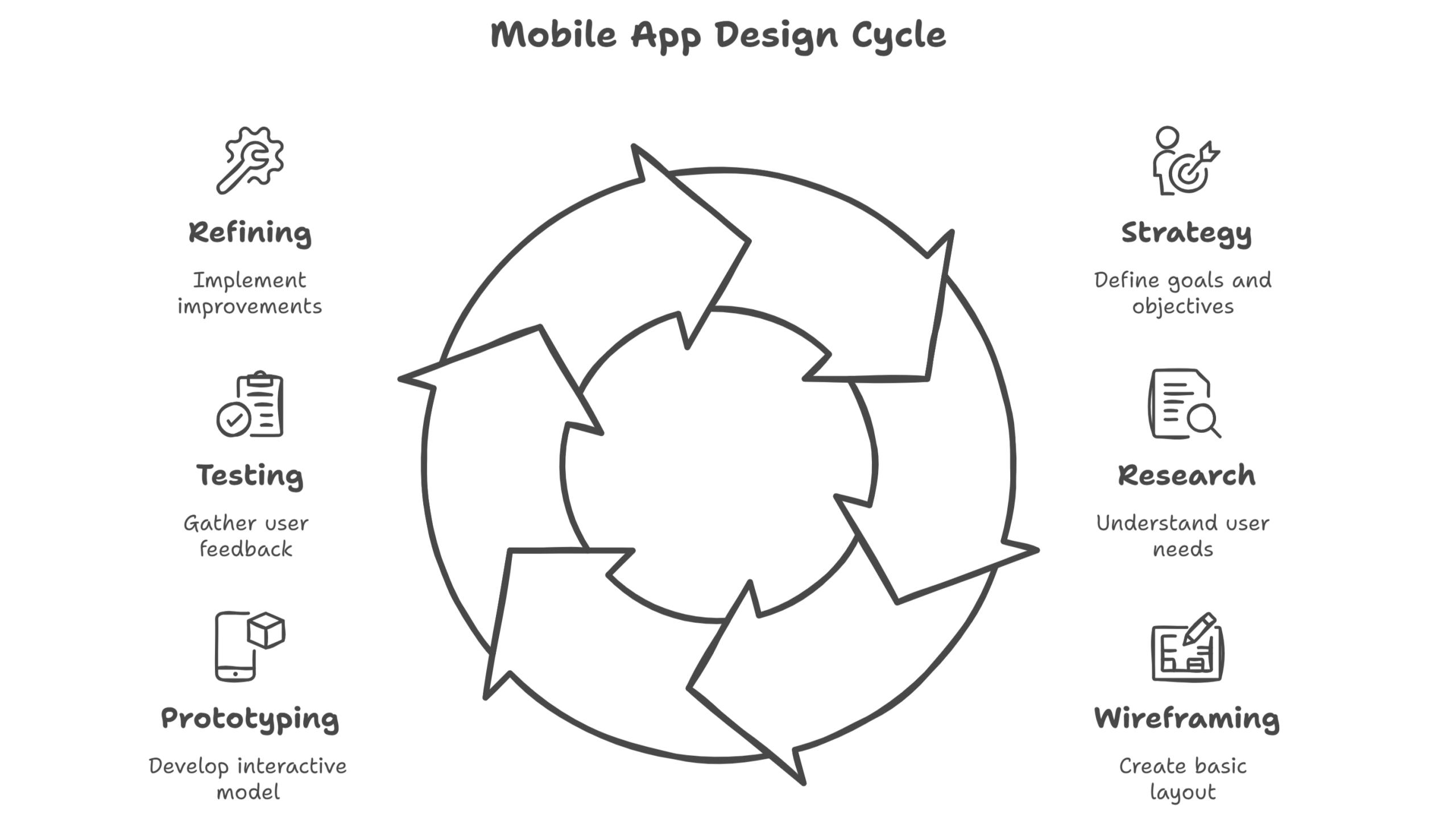
Now that the planning’s done, it’s time to bring your app to life, one screen at a time. The actual workflow might look intimidating at first, but the step-by-step mobile app design process follows a pretty logical rhythm. Here’s a simplified version of what most designers do:
– Sketch your ideas on paper or digitally
– Build a wireframe to map out the basic structure and navigation
– Create a prototype to simulate how users interact with it
– Conduct testing to gather feedback and catch issues early
– Refine the design based on insights, then repeat as needed
Simple, right? Well… simple-ish.
This part of the process thrives on iteration and teamwork. You’re not locked into one design forever, each version gets a little better. Tools like Figma, Adobe XD, and Sketch make it easy to tweak layouts, test animations, and share clickable prototypes with teammates or stakeholders. The beauty of designing mobile apps in stages is that you catch flaws early, adapt fast, and keep things flexible whether you’re building for iOS, Android, or both.
This is where things start to look like an app. Visual design isn’t just about making things pretty: it’s about shaping how users feel before they even interact. Color palettes can suggest energy, calm, trust, or urgency. Typography choices influence readability and tone. Icon styles and spacing set the mood, and even micro-interactions (like a button bounce or swipe animation) can make an app feel intuitive or frustrating. Whether for iOS or Android, great design choices work in harmony to create a first impression that sticks.
But great visuals don’t happen in a vacuum: they grow out of solid branding and thoughtful emotional design. Ever opened an app and instantly thought, “This just feels right”? That’s not luck. It’s consistency. From logo placement to the way alerts are worded, every detail should reflect the app’s personality and purpose. When the UI reflects a clear brand identity, users feel more connected and confident about what they’re using. And that emotional connection is what keeps them coming back.
Designing for iOS and Android isn’t just about screen sizes, it’s about understanding two different philosophies. Apple’s Human Interface Guidelines emphasize clarity, depth, and deference. Android, on the other hand, follows Material Design, which leans into bold colors, meaningful motion, and a modular approach to layout. While the core functionality might be the same, each platform encourages a unique user experience that feels native to its ecosystem.
Here’s a quick side-by-side look at some of the most noticeable design differences between iOS and Android apps:
Navigation
– iOS: Bottom tab bars are the go-to for primary navigation
– Android: Often uses a navigation drawer or bottom nav, depending on complexity
Typography
– iOS: Uses the San Francisco font with a larger base size for easier readability
– Android: Sticks with Roboto, optimized for various screen densities
Iconography & Spacing
– iOS: Tends to favor thinner icons with more whitespace
– Android: Follows a more geometric and consistent grid layout
Understanding these iOS and Android app design differences early on helps avoid awkward mismatches and makes your app feel like it truly belongs—no matter the platform.
Mockups may look polished, but they’re just the dress rehearsal. Real feedback comes during usability testing, when actual users interact with your design and expose all the quirks you never saw coming. Maybe a button is too small, a scroll feels unnatural, or a key feature is buried too deep. Testing helps you catch confusion, frustration, and missed expectations before launch day. The earlier you test, the easier it is to fix. Think of it as your app’s reality check.
Refinement is where good design becomes great. It’s not about scrapping everything and starting over; it’s about adjusting based on real-world input. This is especially true when balancing designs for both iOS and Android. You might keep your core layout the same, but tweak gestures, icons, or placement to match platform norms. The goal isn’t to create two entirely different apps; it’s to make each version feel seamless for its users while keeping your design process efficient. Iteration, not perfection, is the name of the game.
Ready to see if your app idea is worth it? Take a few minutes to answer these key questions to evaluate your app idea and bring your concept into focus. Let’s get started; Clarity begins here.
Thoughtful design isn’t just a nice-to-have; it’s the difference between an app people keep and one they delete after a day. When users can navigate easily, find value quickly, and enjoy the experience, they stick around. Great design reduces confusion, lowers the chance of bugs slipping through, and often leads to better ratings and reviews. It’s how you turn installs into loyal, happy users who actually recommend your app to others.
So no, it’s not magic; it’s method. A well-crafted app design process for iOS and Android doesn’t just make things look good; it sets your app up for long-term success. It means designing with purpose, testing with real people, and fine-tuning every step along the way. The secret sauce? Understanding your users and designing for their expectations, no matter which platform they’re on. The result is an app that doesn’t just work; it feels right.


