
Key Takeaways
- What is the ideal design process for a food delivery app?
A great food delivery app follows a simple flow—onboarding, browsing, customization, checkout, and tracking—each step designed to be fast, intuitive, and satisfying.- How can I make my food delivery app stand out from competitors?
Focus on small but powerful touches like smart reordering, playful microinteractions, and clear visual design. These details build personality and user loyalty.- What are the must-have UX elements in a food delivery app?
Think intuitive navigation, thumb-friendly buttons, personalized suggestions, and accessibility features. These ensure the app works smoothly for every user, every time.
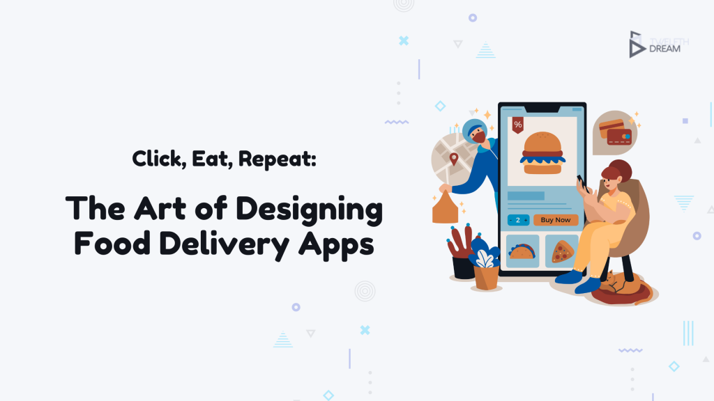
In a world where dinner can be summoned with a few taps, designing food delivery applications has become a mission-critical task, not just a creative exercise. What started as a niche convenience has evolved into a daily habit for millions. Lifestyle shifts, packed schedules, and the appeal of having meals delivered quickly have fueled the rise of mobile food ordering. Behind every fast and satisfying order is a carefully designed interface that guides, simplifies, and enhances the entire experience.
Think of a food delivery app as more than just a digital menu. It is a virtual restaurant, a host, and a delivery assistant all in one. The design sets the tone, shapes expectations, and often determines whether a user completes an order or exits the app in frustration. A smooth and engaging user experience can turn casual users into loyal customers, while clunky or confusing design drives them away. In this blog, we will explore what makes food delivery apps not just functional, but truly enjoyable to use. From first tap to final bite, great design is what keeps people coming back.
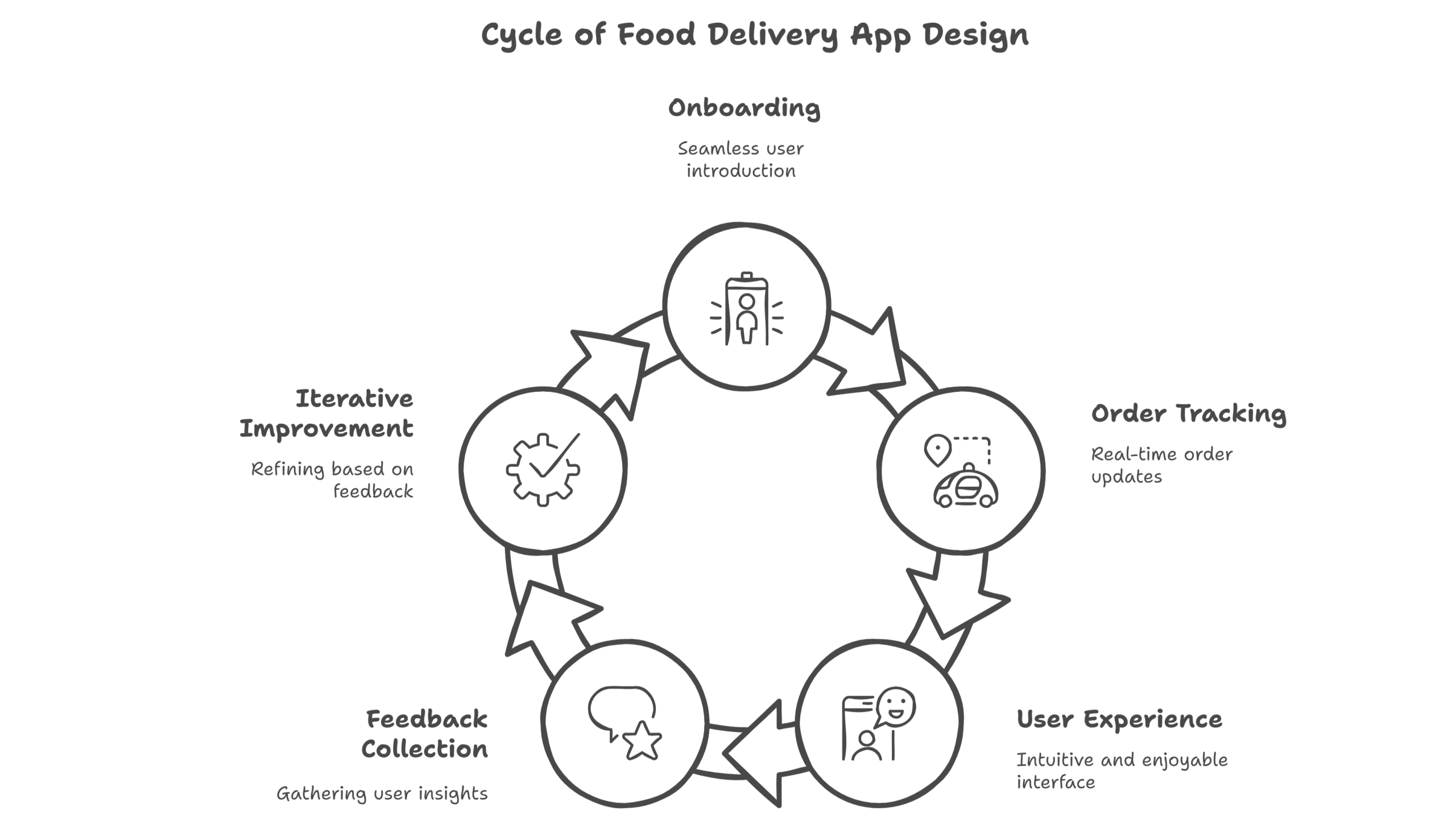
Every great food delivery experience follows a familiar flow, almost like a well-planned meal. The food delivery app design process begins with a warm welcome, onboarding. This is the appetizer, setting the tone with simple sign-ups or logins. Next comes browsing, where users scroll through menus, tap on tempting photos, and explore their options like choosing from a buffet. Then it’s time for customization, adding sides or tweaking toppings. Checkout is the main course, quick, secure, and satisfying. Finally, dessert arrives in the form of real-time tracking and post-order feedback, giving users a sense of control and closure.
Designing each phase with care is what transforms an average experience into a delightful one. Speed is important, but so is enjoyment. If the layout is confusing, if buttons are buried, or if the journey takes too long, users are more likely to abandon their order. That’s why a strong food delivery app design process focuses on removing roadblocks and adding just the right amount of flavor. Whether it’s a well-placed animation, personalized suggestions, or friendly copy, each element should serve a purpose. It’s here where design stops being decorative and starts being strategic.
When thinking about how to design a food delivery app, the goal isn’t to create something completely unfamiliar. Users already know what they want: food, fast, and with minimal effort. The challenge is to stay within that comfort zone while still standing out. That means borrowing what works, like category filters or saved addresses, and then adding a twist. Swipe-to-order gestures, smart reordering based on past behavior, or even playful animations during checkout can keep things fresh without confusing users.
The real magic lies in the details. Great UX is built on clarity and empathy. Menus should be easy to scan, actions should feel natural, and the entire experience should flow without guesswork. That’s where principles like intuitive navigation and thumb-friendly button placement come into play. Smart defaults like auto-filling location or suggesting previous orders save time and boost satisfaction. Designing for different user personas also helps. A student ordering late-night snacks might need speed and simplicity, while a parent planning a family dinner might look for customization and ratings. By keeping users in mind and designing with intention, you can turn a basic app into something people actually enjoy using.
Every extra tap is a chance for someone to get distracted, lose interest, or abandon their cart. That’s why streamlining the user flow, from the moment hunger hits to the final “your order is on its way” screen, is crucial. The journey should feel effortless. Features like autofill for addresses and payment details, one-click reordering, and clearly laid-out visual menus help reduce friction. When users don’t have to think twice about where to tap or what to do next, they’re more likely to follow through and place an order.
But speed alone isn’t enough when it comes to designing food delivery applications. Small, thoughtful touches can turn a routine task into a pleasant experience. Microinteractions like a cart icon that jiggles when you add an item, or a soft chime when the order is confirmed, create a sense of feedback and fun. Animations during loading screens or a friendly “Your food is cooking!” message during tracking add personality. These elements might seem minor, but they build emotional connection and brand recall. A few clever UX choices can be the reason someone chooses your app again instead of scrolling through a competitor’s.
The look and feel of an app are more than surface details: they’re part of the experience. In food delivery app UX design, visual choices influence how users feel and behave. Warm, appetizing colors like reds and oranges can stir up hunger, while clean layouts and intuitive icons help users move through the app with ease. Fonts should be readable at a glance, even during a bumpy train ride or a dimly lit evening scroll. And since most users order from their phones, every screen needs to be optimized for small displays without feeling cramped.
Accessibility isn’t just a nice-to-have, it’s a must. A truly thoughtful design considers every user, from those with visual impairments to people who rely on voice commands. High-contrast text options, text resizing features, and even screen reader compatibility can make a huge difference. These features don’t just expand your reach—they show users you care. Because just like good food, good design should be inclusive. The goal is to create an experience that feels welcoming, usable, and satisfying for everyone, no matter their device, environment, or abilities.
Thinking of launching or improving your food delivery app? Find out how much a custom-built solution could actually boost your profits. Take the ProfitBoost Score assessment and discover whether your app idea has the ingredients for long-term success.
Start your assessment now and get your score out of 100—no guesswork, just insights.
Designing food delivery applications isn’t a project you cross off a to-do list: it’s an ongoing relationship with your users. Preferences change, new devices appear, and trends shift faster than a lunch rush. That’s why continuous improvement is key. Tools like A/B testing help compare design choices in real time. Heatmaps reveal where users hesitate or drop off, and direct feedback highlights what’s working and what’s not. Treating design as a living, evolving process keeps your app fresh, functional, and ahead of the curve.
The most successful apps do more than deliver meals; they become part of people’s routines. That kind of loyalty is earned through consistent, thoughtful design that puts the user first. From intuitive navigation to eye-catching visuals and subtle interactions that spark joy, each detail adds up. When users feel like your app just “gets them,” they’re not just ordering food, they’re coming back to a place that feels familiar and easy. By staying curious, testing often, and designing with purpose, you create more than a tool. You build a trusted companion for everyday cravings. That’s what long-term success tastes like.


